NYPL redesign
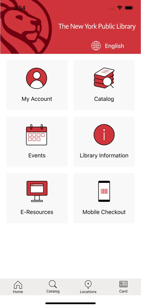
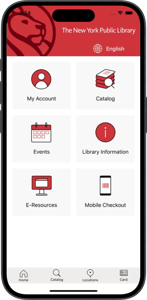
Serving a population of over 3.5 million, the New York Public Library catalog app steps into the digital age with this powerful redesign.
Summary
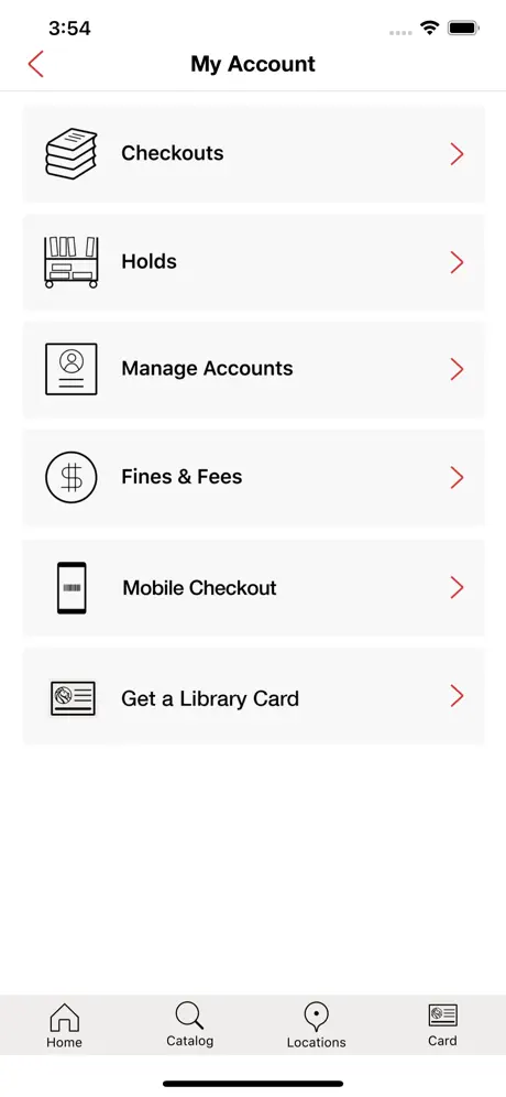
Using a prompt generated by Google’s Gemini to mimic working for a client, I was tasked to redesign the NYPL app with the goals of improved navigation, personalized recommendations, and features to engage younger audiences. This project lasted 8 weeks, from conducting user research to high fidelity prototypes.
let’s reinvent the wheel
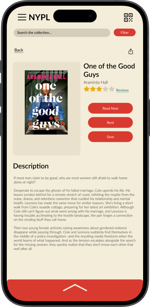
I used the Double Diamond approach when beginning to tackle this project, which started with defining not only the branding of the NYPL, but the culture and the communities they serve. Working off of qualitative research and competitive analysis I was able to construct a list of features that are important to users such as book reviews, personalized recommendations, filtered searching, and account management.
CLASSIC, WITH A MODERN TWIST
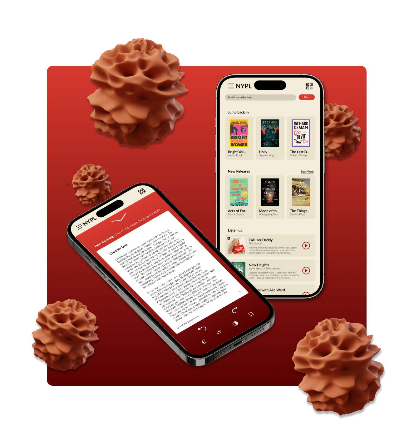
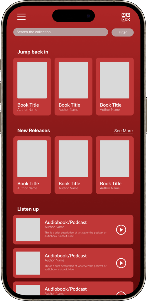
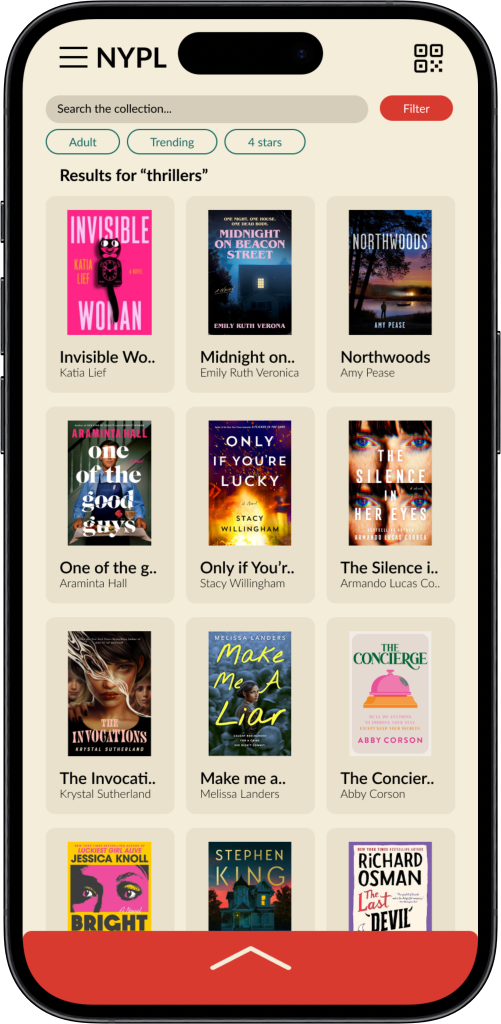
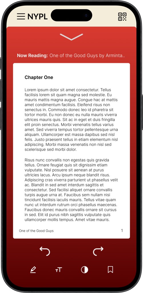
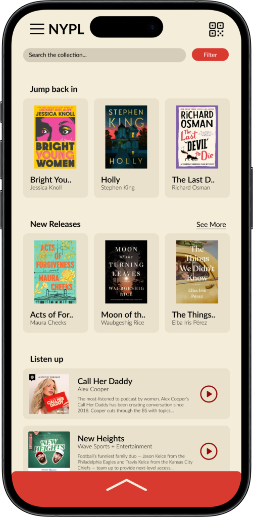
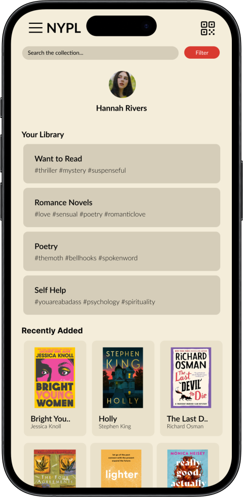
Once the features got carved out, the next step was taking the iconic red and white branding of the NYPL and transform it into something more modern without losing those functions. I experimented with the two aesthetics shown below; the first rendition of the design being the gradient red. With so many red components, I found it difficult to display any type of visual hierarchy. I changed the design to a warm cream color - like the pages of a book - to increase legibility and the use of red for visual hierarchy instead.
read or listen…anywhere
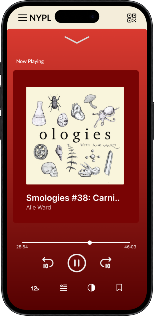
I wanted the user experience to feel like not just the NYPL, but your NYPL (circling back to engaging younger audiences and creating more personalization). How could I make literature consumption more convenient and engaging? The solution became an e-reader and audio player right in the app. The bottom arrow toggle allows you to open and close the reader whenever you need, enabling users to start consuming content with one click upon opening the app.
YOUR LIBRARY, ONLINE
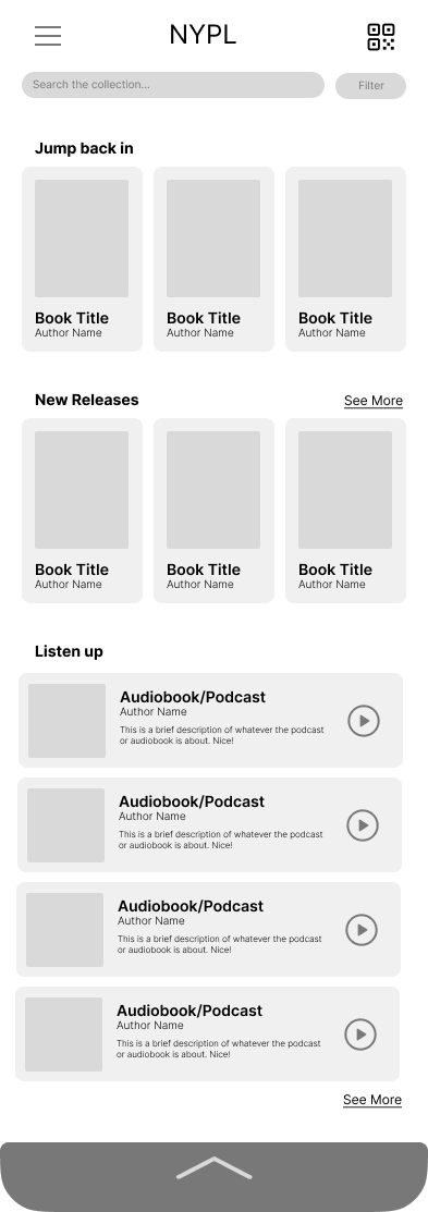
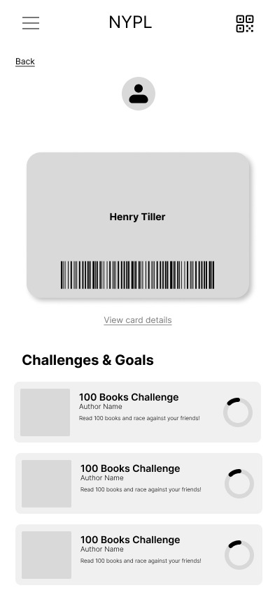
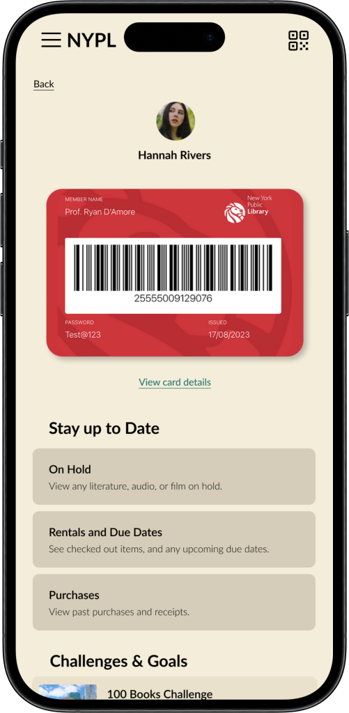
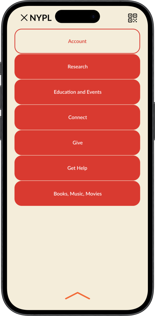
The homepage has quick links to personalized suggestions, recent reads, and suggested audios, serving as the users personally curated bookshelf. A hamburger menu on the top left opens a menu that allows the user to view their saved content organized in collections of their design. The QR code on the top right gives the user access to their library card and account information.
potential for scale
There is huge potential for scale in this project, both for the large community they serve and the complexity that is a library system. In future iterations I would include better search results that include more info (like aisle number and ISBN) and improve the filtering system, showing how it actually works in prototype. I would love to expand the social events cards (like reading challenges and book clubs) to function both virtually and in-person as this will draw more people to the app.
Another point for improvement would be the user journey throughout the app. I think there could be a better balance of the depth of what the library has to offer along with keeping the navigation as simple as possible. Since the library serves such a wide collective of all backgrounds, the navigation could use more user research before future iterations.
